How I Brand Entire Product Lines Using Recraft AI, Figma, and Claude Code
The Old Way Is Dead
Branding used to mean one of two things: spend thousands on a design agency, or spend weeks in Illustrator teaching yourself bezier curves. If you're an indie developer shipping multiple products, neither option scales.
I recently rebranded my indie studio Helsky Labs and all its products — plus my own personal brand, helrabelo.dev. Not one at a time over months — everything in a single sprint. The result: a cohesive product family where every app looks like it belongs.


Here's exactly how I did it, with real examples from the process.
The Stack
Three tools. That's it.
| Tool | Role | Why This One |
|---|---|---|
| Recraft AI | Vector logo generation | Outputs native SVGs via API, not rasters. This is the killer feature. |
| Figma | Design system assembly | Review, refine, export. The design source of truth. |
| Claude Code | Pipeline orchestration | API calls, SVG manipulation, variant generation, file management. |
The magic is in the combination. Recraft generates vectors you can actually manipulate programmatically. Claude Code handles the tedious orchestration. Figma is where you make creative decisions.
Step 1: Define Your Brand Direction (Before Touching Any Tool)
This is where most people go wrong. They open the AI tool first and hope something good comes out. Don't.
Before generating a single image, answer these questions for each product:
-
What's the visual metaphor? Not "a logo" — what does the icon represent? For Gitography, it's a git branch merging with a map pin — code history as geography. For BookBit, it's a page being turned. Be specific.
-
What's the personality? Professional but approachable? Playful but not childish? Write it down in 2-3 sentences.
-
What's the color territory? Pick a hue range and own it. No two products should share the same primary color family.
-
What sizes does it need to work at? An app icon that looks great at 512px but turns to mush at 16px is useless.
This planning takes 15-20 minutes per product but saves hours of "generate, hate it, regenerate" cycles.
Real Example: The helrabelo.dev Personal Mark
For my personal brand, the brief was clear: I needed a monogram that felt like a signature — something that could work laser-engraved on leather, stamped on paper, or as a 16px favicon. The direction:
- Visual metaphor: The letters "HR" interlocked as a single continuous mark — like a personal stamp or seal
- Personality: Minimal, precise, slightly artisanal. A developer's mark, not a corporate logo
- Color territory: Monochrome. The personal brand should whisper, not compete with product brands
- Size range: Must survive 16px (browser tab) and look intentional at 128px+
Step 2: The Recraft API (Vector Generation)
Recraft is the only AI image tool I've found that outputs true vector SVGs. This matters enormously for logos because:
- You can change colors programmatically (sed, not Photoshop)
- They scale infinitely (favicon to billboard)
- File sizes are tiny (2-10KB per logo)
- You can compose them (icon + wordmark = lockup)
Generating Icon Variations
API_KEY="your_recraft_api_key"

curl -s https://external.api.recraft.ai/v1/images/generations \
  -H "Content-Type: application/json" \
  -H "Authorization: Bearer $API_KEY" \
  -d '{
    "prompt": "minimalist logo icon, stylized curly braces with a centered diamond node, clean geometric lines, modern flat design, developer-focused, no text",
    "model": "recraftv4_vector",
    "size": "1024x1024",
    "n": 6,
    "controls": {
      "colors": [
        {"rgb": [16, 185, 129]},
        {"rgb": [5, 150, 105]}
      ],
      "background_color": {"rgb": [255, 255, 255]}
    }
  }' > icon-response.json
Key parameters:
model: "recraftv4_vector"— This is what gives you SVGs. The regularrecraftv4gives rasters.n: 6— Always generate the maximum. More options = better selection. It costs 8 credits per image (48 total), roughly $0.50.controls.colors— Constrains the palette to your brand colors. Without this, Recraft picks whatever it wants.controls.background_color— Almost always white for logo work.
Real Example: Generating the HR Monogram
For my personal mark, this was the actual Recraft API call:
curl -s https://external.api.recraft.ai/v1/images/generations \
  -H "Content-Type: application/json" \
  -H "Authorization: Bearer $API_KEY" \
  -d '{
    "prompt": "minimalist monogram logo combining letters H and R, interlocked letterforms, single continuous stroke feel, clean geometric, modern, no background decoration, no text besides the letters",
    "model": "recraftv4_vector",
    "size": "1024x1024",
    "n": 6,
    "controls": {
      "colors": [{"rgb": [20, 20, 20]}],
      "background_color": {"rgb": [255, 255, 255]}
    }
  }' > hr-response.json
Notice: monochrome on purpose. Dark gray (rgb(20,20,20)) instead of pure black gives it a slightly softer, more refined feel.
Generating Wordmarks
Same API, different prompt strategy:
curl -s https://external.api.recraft.ai/v1/images/generations \
  -H "Content-Type: application/json" \
  -H "Authorization: Bearer $API_KEY" \
  -d '{
    "prompt": "clean modern wordmark logo text \"TokenCentric\", elegant minimal sans-serif typography, single weight, simple letterforms, white background, no icon no symbol just the text",
    "model": "recraftv4_vector",
    "size": "1024x1024",
    "n": 6,
    "controls": {
      "colors": [{"rgb": [16, 185, 129]}],
      "background_color": {"rgb": [255, 255, 255]}
    }
  }' > wordmark-response.json
Prompt Engineering Tips
What works:
- Be specific about what you don't want. "No text" in icon prompts. "No icon no symbol" in wordmark prompts.
- Reference concrete shapes. "Stylized curly braces" beats "code-related icon."
- Describe the feeling. "Developer-focused, precise, technical but approachable" guides the aesthetic.
- Keep it short. Long prompts dilute the signal. 2-3 sentences is the sweet spot.
What doesn't work:
- Asking for multiple concepts in one prompt. "A book AND a gear AND the letter B" gives you a mess.
- Being too abstract. "Innovation and synergy" produces generic corporate art.
- Specifying exact layouts. "Icon in upper-left with wordmark below-right at 30 degrees" — the model ignores spatial instructions.
Step 3: Review and Select
This is where the review boards come in. I build simple HTML pages that render all options side by side at multiple sizes, on light and dark backgrounds. Claude Code generates these automatically from the API response.
Here's the actual review board I used to select the helrabelo.dev personal mark — HR monogram on top, alternative "hel" monogram below, with a preview panel showing the selected option at small sizes, on dark backgrounds, and simulating leather engraving:
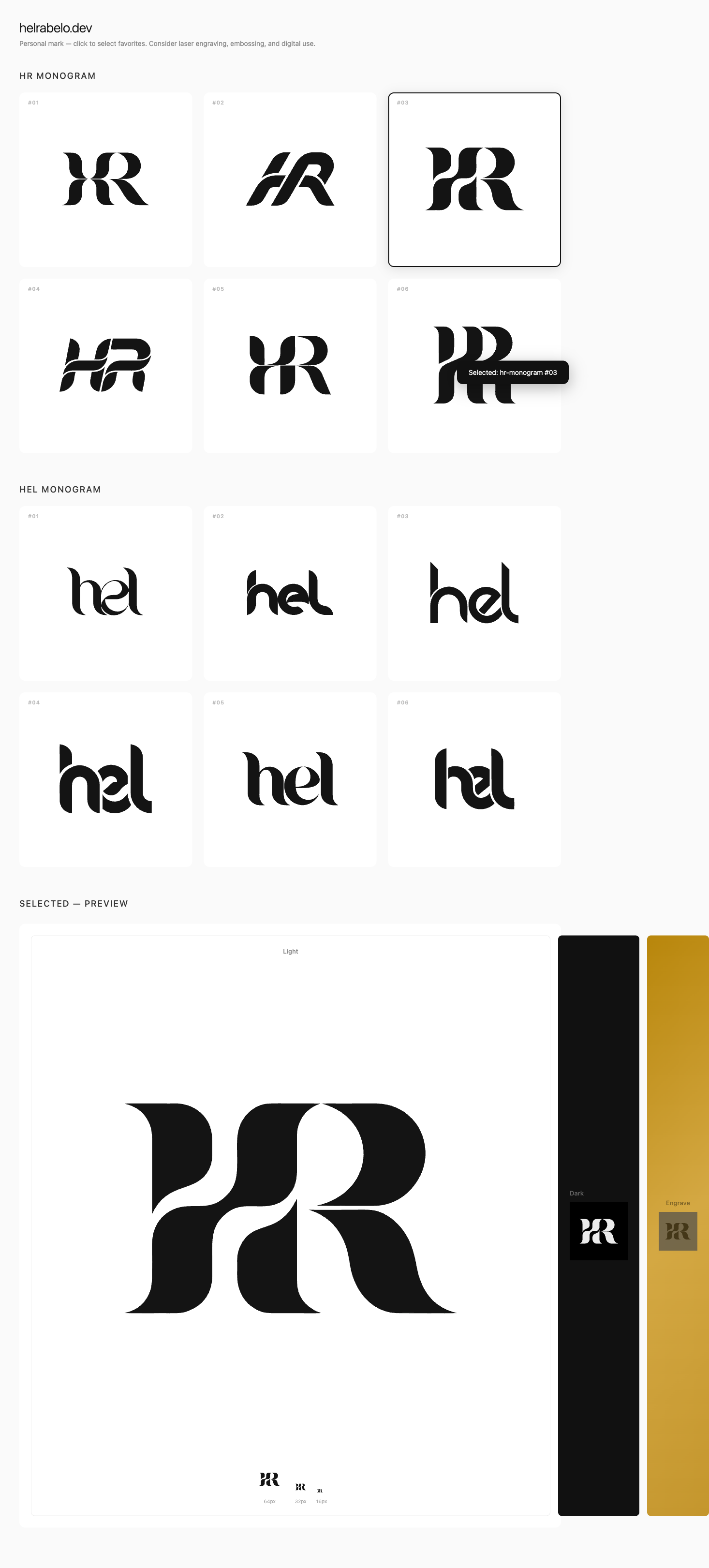
The 16px test is non-negotiable. If the logo isn't recognizable in a browser tab, it fails. This kills about 40% of generated options immediately.
I evaluate on three criteria:
- Does it read at 16px? (Most important)
- Does it communicate the product's purpose?
- Would it look right next to the other products in the family?
Why Option 3 Won
Looking at the review board, HR monogram #03 (top right) won because:
- 16px test: The interlocking stroke has enough contrast and distinction to read at favicon size. Several others collapsed into blobs.
- Signature feel: It reads like a handcrafted monogram — the H and R flow into each other naturally, like a wax seal or a typographer's mark.
- Versatility: The single-stroke approach means it works in any color, on any background, at any size. No fine details that disappear when scaled down.
Options 1 and 5 were close contenders, but their thinner strokes lost legibility at small sizes. Option 2 was too simple — it didn't feel intentional enough. Options 4 and 6 had interesting geometry but felt more corporate than personal.
Gitography: A Different Kind of Review
For Gitography (a git analytics tool), the review board was more elaborate — it included brand color definitions, icon options, and wordmark variations all on one page:
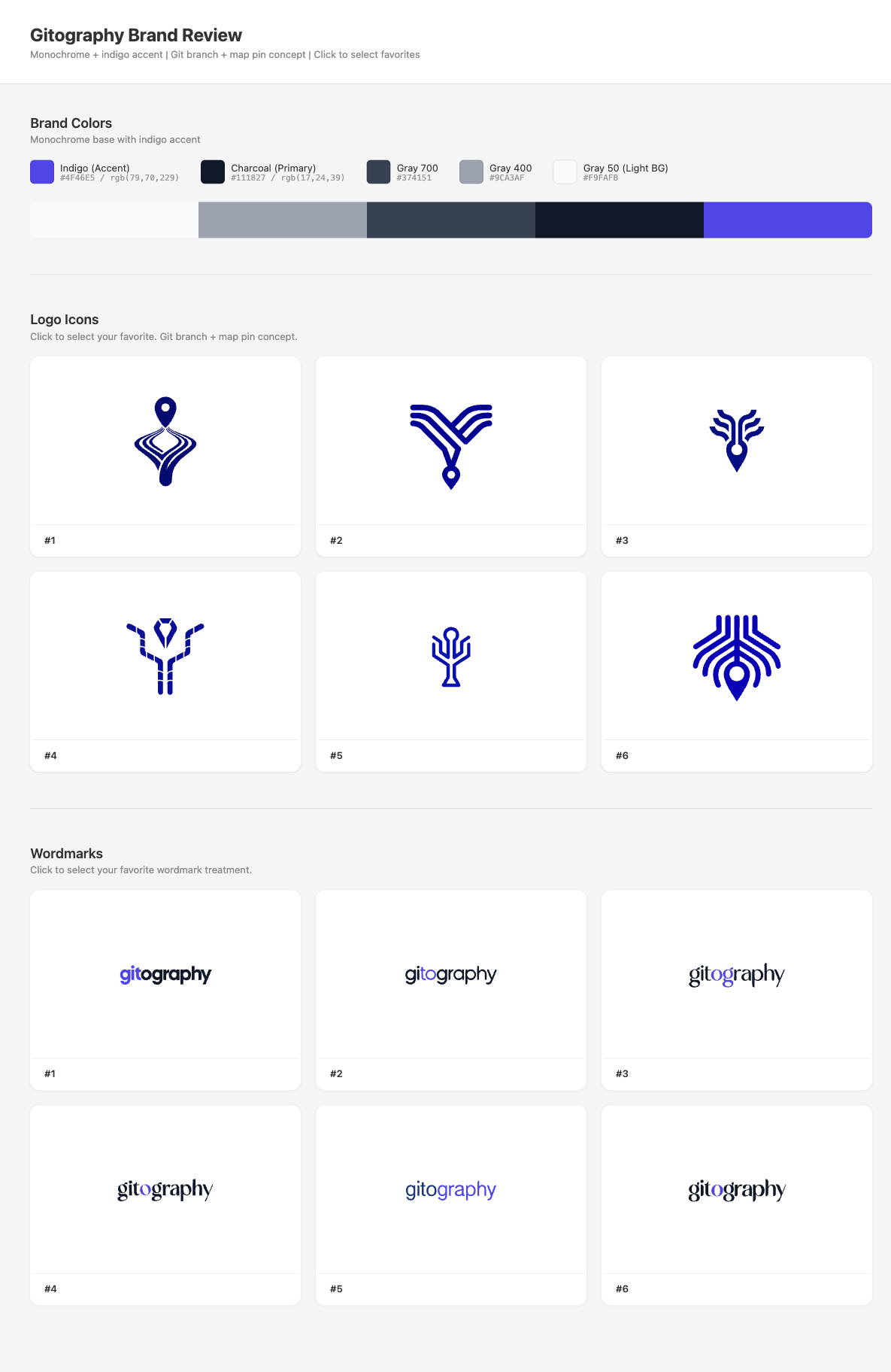
Different product, different prompt ("git branch merging with a map pin, connected nodes, data visualization feel"), different color territory (indigo #4F46E5), same workflow. Icon #5 and wordmark #1 were selected.
Step 4: Color Variant Generation (The Automation Magic)
This is where Claude Code earns its keep. Once you've picked your icon and wordmark, you need 6 color variants of each:
| Variant | Use Case |
|---|---|
| Color on white | Primary/default usage |
| Color on transparent | Cards, overlays |
| Black on white | Print, monochrome contexts |
| Black on transparent | Dark surface overlays |
| White on dark | Dark mode, dark backgrounds |
| White on transparent | Flexible dark placement |
Doing this manually in a design tool means opening each SVG, changing fills, exporting. For 3 asset types (icon, wordmark, lockup) x 6 variants = 18 files per product. Across 7 products = 126 SVGs.
With Claude Code, it's a conversation:
"Generate all 6 color variants for the selected icon, wordmark, and lockup. Primary color is #10B981, dark background is #0D1117."
Claude reads the SVG source, identifies the fill layers (background rect, main shape, detail shapes), and generates all variants programmatically using string replacement:
# Simple color swap
sed "s|fill=\"rgb(16,185,129)\"|fill=\"rgb(0,0,0)\"|g" icon-color.svg > icon-black.svg

# Remove background for transparent variants
# (delete the first <path> which is always the bg rect in Recraft SVGs)
The white-on-dark variant is trickier because you need to swap the layer order logic, but it's still deterministic string manipulation — exactly what a code assistant excels at.
Real Example: HR Mark Final Variants
Here's the final production review board for the HR mark — all 6 variants with use case previews (browser tab, paper stamp, leather engrave, dark UI header) and a scale test down to 16px:
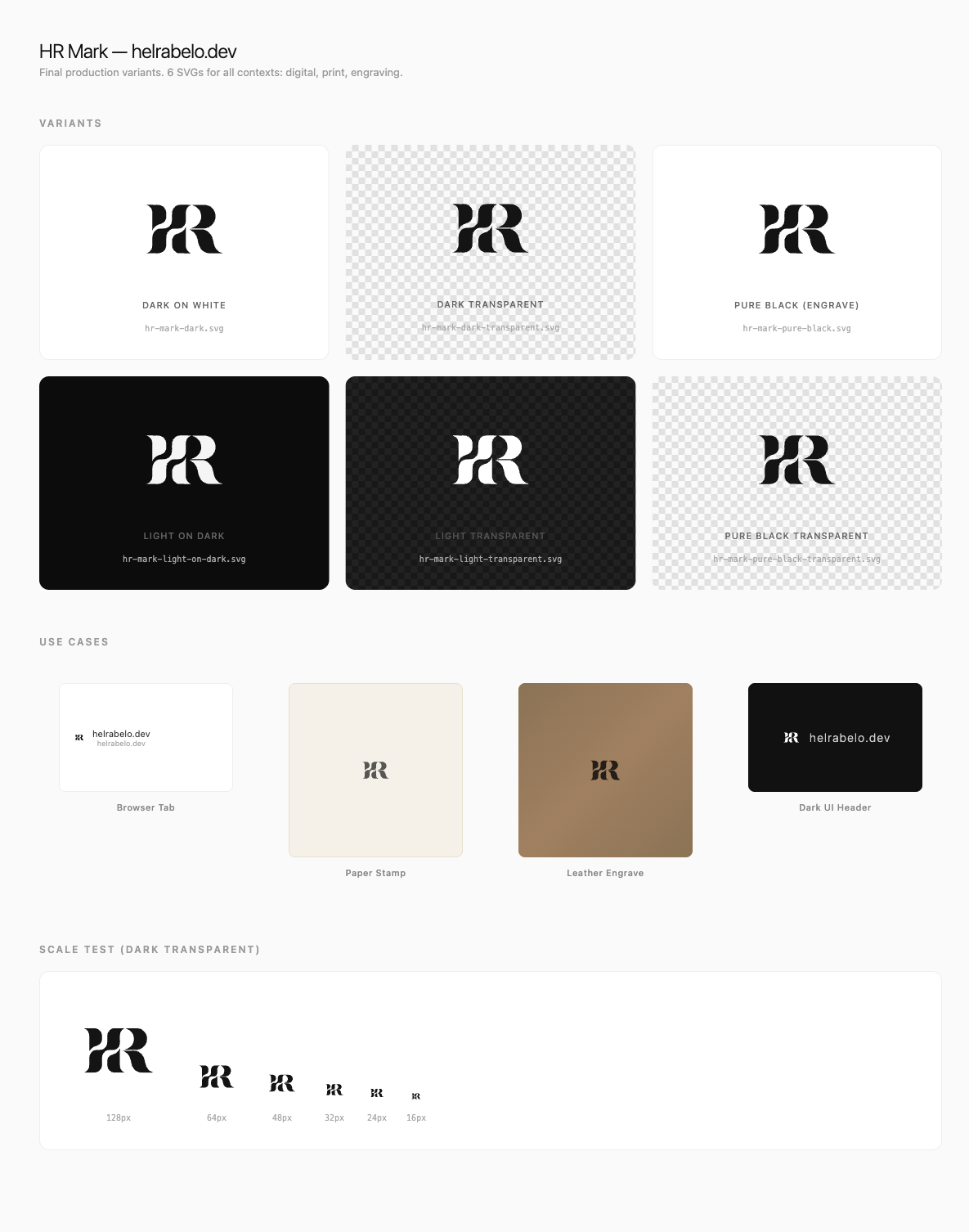
One SVG in, six production-ready variants out. Each one is a clean, editable vector file under 6KB.
Gitography: The Full Treatment
For a product like Gitography, the variant generation produces the complete brand kit — icon, wordmark, and stacked lockup, each in 6 variants:
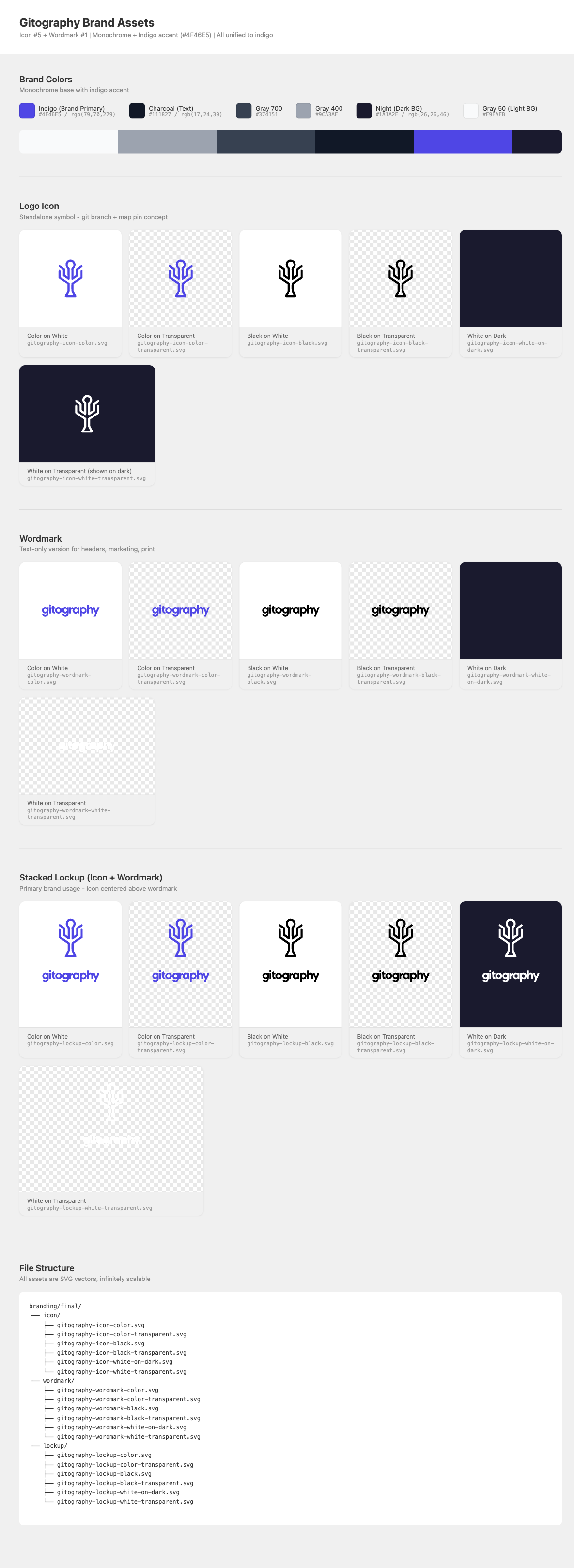
That's 18 production SVGs for one product, generated in seconds. The file structure at the bottom shows how everything is organized.
Step 5: Figma Assembly
With all SVGs generated, they go into Figma for:
- Visual review — Seeing all variants on a proper canvas
- Design system setup — Creating color styles, typography scales, component variants
- Export control — Platform-specific exports (PNG at various sizes, ICO, ICNS)
- Brand guidelines — Usage rules, spacing, minimum sizes
I don't design in Figma. I organize in Figma. The creative generation happened in Recraft. Figma is the library.
Step 6: The Asset Pipeline
Logos are just the beginning. Each product needs platform-specific assets:
- Web: 6 favicon sizes, Apple touch icon, Android PWA icons, OG image
- Desktop: .icns (macOS), .ico (Windows), DMG background
- Mobile: Expo icons, adaptive icons, splash screens, App Store assets
- Social: Twitter profile/header, LinkedIn banner, GitHub avatar, Product Hunt
We built a bash pipeline that generates all of these from a single source SVG:
./tools/generate-assets.sh tokencentric logo.svg electron-app
./tools/sync-to-projects.sh tokencentric
One source file in. Dozens of platform-specific assets out. The pipeline handles resizing, format conversion, safe-zone cropping for Android adaptive icons, and all the platform quirks nobody wants to think about.
The Results
Across 7 products + 1 personal brand:
- 126 SVG brand assets (icon + wordmark + lockup x 6 color variants x 7 products)
- 280+ platform-specific assets (favicons, app icons, social cards, etc.)
- ~560 Recraft credits (~$7 total)
- 1 design system with shared typography, icon language, and marketing patterns
- 1 sprint from start to deployed
Every product now looks like it belongs to the same family while maintaining its own distinct identity. The color territory map ensures instant recognition. And the personal HR mark anchors it all — a quiet, monochrome signature that says "made by Hel" without competing with the product brands.

Tips for Your Own Brand Sprint
Start with the family, not the individual
Design the system first (shared typography, icon style rules, color territories), then fill in the individual products. Top-down beats bottom-up.
Use Recraft's color controls aggressively
Without controls.colors, you'll get beautiful logos in colors that don't match your brand. Pin the palette.
Test at 16px immediately
Don't fall in love with a logo at 512px. Open it at favicon size first. If it doesn't work small, it doesn't work.
Automate the variants
If you're manually creating dark mode, transparent, and monochrome versions of each logo, you're wasting time. SVGs are text files. Treat them like code.
Let Claude Code handle the pipeline
The tedious parts — API calls, file downloads, SVG manipulation, color swapping, file organization, review page generation — are exactly what AI coding tools excel at. Save your creative energy for the decisions that matter: which icon best represents your product?
The parent brand should whisper
If your studio brand competes visually with your products, something's wrong. Helsky Labs went monochrome specifically so each product's color could shine.
The Shift
A year ago, this level of brand work required either a significant budget or weeks of solo design effort. Today, the bottleneck isn't creation — it's curation. The AI generates more quality options than you can review. Your job is taste, not technique.
That's not a small thing. Taste is what separates good brands from generic ones. AI handles the mechanical skill of drawing clean vectors. You handle the judgment of which vector tells the right story.
For indie developers shipping real products, this is a genuine unlock. Professional-quality branding, at API-call prices, in sprint-sized timeframes.